CSS Container Query: A Media Query on Steroids
She's finally here. Well, almost.
One of the most requested web features finally sees the light of day. As of today, container query is on its first public working draft — meaning this feature has proven to be essential and deemed possible to be included in future versions.
You can even try it now on Google Chrome. Go to chrome://flags/#enable-container-queries on your Chrome browser, set it to enabled and you’re good to go.
Container Query
A new CSS query that offers a possibility for a descendant element to apply styling rules based on the container.
While media query applies specific styling based on viewport and media preferences, container query takes it a step further by allowing the contained element to target the container elements. This offers more granular controls to the contained element.
Here's simple usage of container query,
.card {
    background-color: red;
}

.container {
    container-type: inline-size;
}

@container (min-width: 300px) {
    .card {
        background-color: blue;
    }
}
This basically tells the browser to apply style background-color: blue if the container is at least 300px wide.
The syntaxes are fairly simple and quite similar to that of media query. Container query comes with three extra properties and a rule.
First, we have container-type, this property is used to establish the element as query container, this will allow the child component to query against it.
.foo {
  container-type: none | style | state | size | inline-size | block-size;
}
Second, container-name sets a name to the container for further filtering. Sometimes we might not want to target the nearest ancestor container, this property serves as an escape hatch.
.foo {
  container-name: my-container;
}
And finally, container is used as a shorthand property that can be used to set both container-type and container-name in a single declaration.
.foo {
  container: inline-size / my-container;
}
To target the container, we use @container to specify the rule to target the nearest containment context.
// Applies if the nearest query container is at least 700px wide
@container (min-width: 700px) {}

// Applies if the nearest query container has an inline-size of more than 100px
@container (inline-size > 100px) {}

// Applies if the nearest query container named `my-component` is at least 700px wide
@container my-component (min-width: 700px) {}
This is very exciting because the child element can be made aware of its surroundings and can decide for itself how to react.
A Highly Modular Component
Consider a Card component, a fairly common piece of an element that you've probably seen before. This component has the following attributes: A thumbnail, a headline, a description, and some tags.
We want the component to adapt to different screen sizes. On the smallest viewport, the thumbnail and details are stacked vertically. On a slightly larger viewport, the thumbnail will reside on the left. And finally, on the largest viewport, our content will sit on top of the thumbnail.
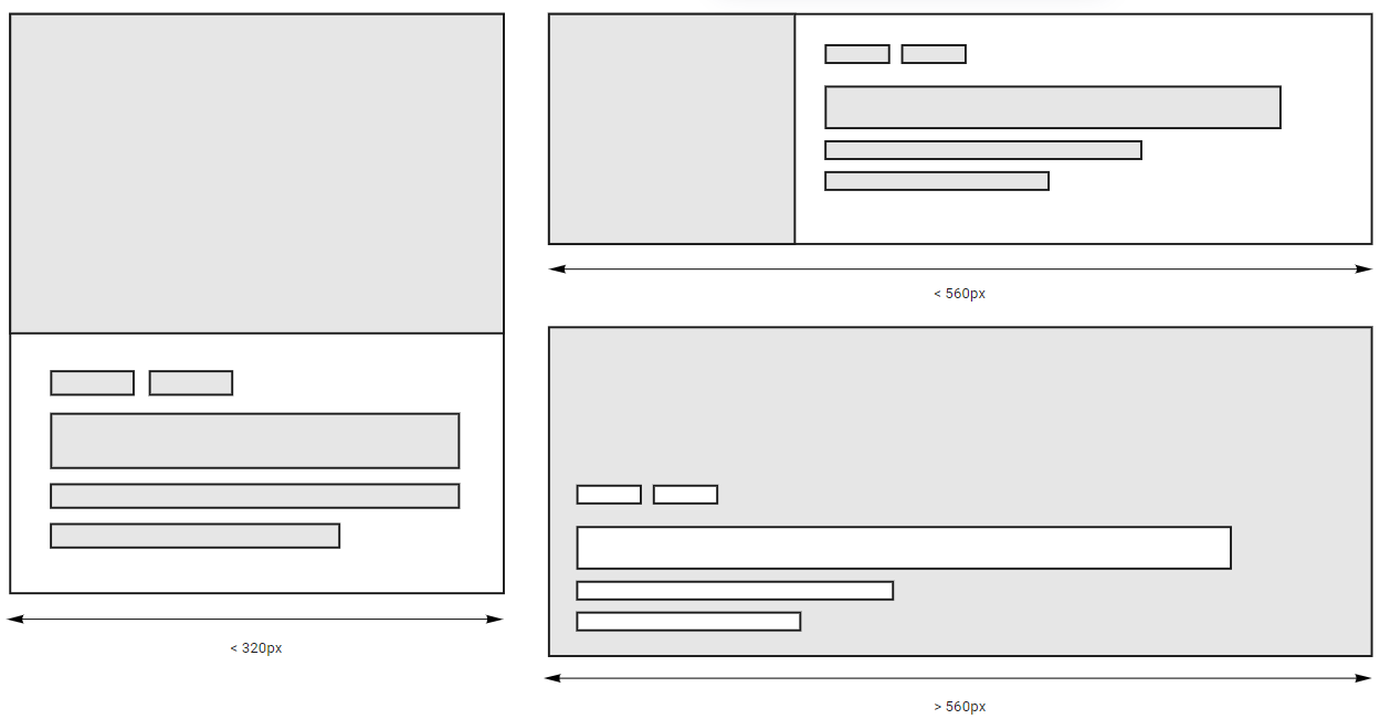
Let's start with the HTML codes,
<div class="card">
    <div class="card-thumbnail">
        <div class="card-thumbnail-wrapper"></div>
    </div>
    <div class="card-detail">
        <div class="card-tag">
            <div class="card-tag-item">Technology</div>
            <div class="card-tag-item">Entertainment</div>
        </div>
        <h3 class="card-title">Headlines: The Good, The Bad, and The Ugly</h3>
        <div class="card-description">
            Lorem ipsum dolor sit amet, consectetur adipiscing elit. Quisque aliquam eros justo, sit amet sollicitudin ligula aliquet vel. Sed a neque turpis.
        </div>
    </div>
</div>
And the CSS,
.card {
    background-color: #ffffff;
    border-radius: 8px;
    box-shadow: 0 2px 6px rgba(0, 0, 0, .5);
}

.card-thumbnail {
    flex: 0 0 auto;
    background-color: #DFDFDF;
    border-top-left-radius: 4px;
    border-top-right-radius: 4px;
    overflow: hidden;
}

.card-thumbnail-wrapper {
    padding-bottom: 56.25%;
    position: relative;
    background-image: url('./mountain.jpeg');
    background-size: cover;
    background-position: center;
}

.card-detail {
    padding: 12px;
}

.card-title {
    font-size: 15px;
    line-height: 19px;
    font-weight: 600;
    margin: 8px 0 0 0;
}

.card-description {
    font-size: 13px;
    line-height: 17.2px;
    margin-top: 8px;
}

.card-tag {
    display: flex;
    justify-content: flex-start;
    gap: 12px;
}

.card-tag-item {
    color: #ffffff;
    background-color: #333;
    padding: 4px 6px;
    border-radius: 6px;
    font-size: 12px;
    font-weight: 600;
}
So far so good. Our card looks good on a smaller screen, exactly as we planned.
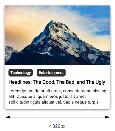
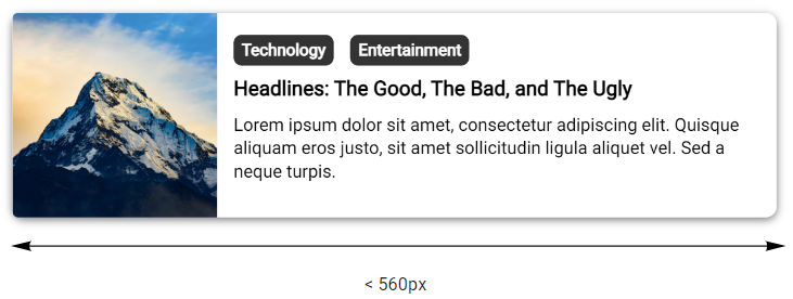
On a slightly larger viewport, instead of media query, we will utilize container query to help us deal with the transformation.
@container (min-width: 321px) {
    .card {
        display: flex;
    }

    .card-thumbnail {
        width: 150px;
        border-top-right-radius: 0;
        border-bottom-left-radius: 4px;
    }

    .card-thumbnail-wrapper {
        padding-bottom: 100%;
    }

    .card-detail {
        padding: 16px 12px;
    }
}
We can use display: flex; to stack the content horizontally, and we also added some minor adjustments to the thumbnail and details to ensure it still looks good.
And finally, on the largest viewport we updated our thumbnail to fill up the spaces, add some dark overlay on top of the thumbnail with background: linear-gradient(....);, we also set our .card-detail to position: absolute; and changed the color of our headline and description to #ffffff
@container (min-width: 561px) {
    .card {
        position:  relative;
    }

    .card-thumbnail {
        width:  100%;
    }

    .card-thumbnail-wrapper {
        padding-bottom: 45%;
    }

    .card-thumbnail-wrapper::after {
        content: '';
        position: absolute;
        top: 0;
        left: 0;
        width: 100%;
        height: 100%;
        background: linear-gradient(to bottom, rgba(0, 0, 0, 0.05), rgba(0, 0, 0, 0.55));
    }

    .card-detail {
        padding: 28px 20px;
        position: absolute;
        bottom: 0;
        left: 0;
    }

    .card-title {
        font-size: 20px;
        color: #ffffff;
    }

    .card-description {
        font-size: 15px;
        color: #ffffff;
    }
}
Our card now looks like this if the container is at least 560px wide.
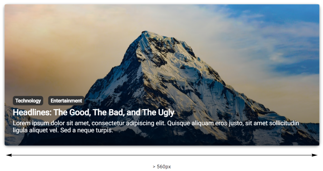
Awesome, our card component looks great on different viewports. But more importantly, what makes container query excel is that we can reuse the same component in more complex layouts.
I created an example to demonstrate the prowess of container query,
<div class="grid-4">
    <div>
        <div class="card">...</div>
    </div>
    <div>
        <div class="card">...</div>
    </div>
    <div>
        <div class="card">...</div>
    </div>
    <div>
        <div class="card">...</div>
    </div>
</div>
<div class="grid-2">
    <div>
        <div class="card">...</div>
    </div>
    <div>
        <div class="card">...</div>
    </div>
</div>
<div class="grid-1">
    <div>
        <div class="card">...</div>
    </div>
</div>
.grid-4,
.grid-2,
.grid-1 {
    display: grid;
    column-gap: 24px;
    margin-top: 24px;
}

.grid-4 > div,
.grid-2 > div,
.grid-1 > div {
    container-type:  inline-size;
}

.grid-4 {
    grid-template-columns: 1fr 1fr 1fr 1fr;
}

.grid-2 {
    grid-template-columns: 1fr 1fr;
}

.grid-1 {
    grid-template-columns: 1fr;
}
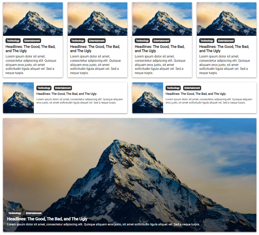
The same components, under the same viewport, adapt to different layouts gracefully. Without container query, you would need a workaround to make this work, perhaps by adding a class name to differentiate the selector or involving Javascript.
Moreover, depending on global viewport via media query makes our component less modular — in other words, they are much harder to reuse across different layouts.
Size and Other Aspects
We might not always know the dimension ahead of time. But worry not, the container query comes with a number of declarative query types you can use to evaluate against the container.
Container Size Query
The first type, container size query establishes the container to enable query against its size. Possible values of this type are size, inline-size and block-size.
size type establishes the container to be queried against its size in both inline and block axis.
In CSS, inline and block axes refer to the direction in which text flows within a line. For example in the English language, text flows from left to right and top to bottom.
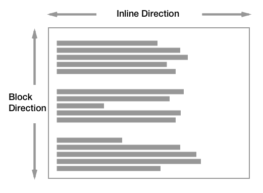
Container set to a size type allows it to be queried upon its width and height. And similarly, inline-size and block-size allows query upon container's width and height respectively.
Container Style Query
The second type is called container style query. This type opens up the possibility to query a container based on its single, specific property.
Container State Query
The third type, container state query establishes the container to enable query against the "current state" of the container such as whether a position: sticky container is "stuck" or that it is currently visible on screen.
Most likely, you would only need size query under normal circumstances but I'm not here to judge 😅. Besides, these are still drafts and might expect changes in the future. But it does give us a glimpse of what's possible with container query.
Conclusion
The idea of responsive design is fantastic — a user interface so versatile that no matter what device you're on, it always looks elegant and flawless. And thus far, this idea has been mostly achievable with the current state of technology.
I said mostly because there are some cases that just couldn't be solved with media query alone. Often time many smaller tweaks need to be made in order to fit components gracefully into complex layouts. And these are some of the problems container query intend to address.